CSS Flexbox
It is new layout mode in CSS and it is used to design flexible layout structure without using float or position property. It provides a more efficient way to layout,
align and distribute space among items in the container.
It is mainly used to make CSS3 capable to change its item?s width and height to best fit for all available spaces.
It is preferred over block model.The most impressive thing of flexbox is that it is a responsive layout structure.
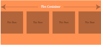
The CSS3 flexbox contains flex containers and flex items.
Flex container:The flex container specifies the properties of the parent. It is declared by setting the display property of an element to either flex or inline-flex.
Flex items:The flex items specify properties of the children. There may be one or more flex items inside a flex container.
Let's take an example to show three flex items within a flex container. By default, they are set along the horizontal flex line, from left to right.
See an example:
<!DOCTYPE html>
<html>
<head>
<style>
.flex-container {
display:-webkit-flex;
display:flex;
width: 400px;
height: 200px;
background-color:lightpink;
}
.flex-item {
background-color: brown;
width: 100px;
height: 100px;
margin: 10px;
font-size:30px;
color:white;
text-align:center;
}
</style>
</head>
<body>
<div class="flex-container">
<div class="flex-item"> 1 </div>
<div class="flex-item"> 2 </div>
<div class="flex-item"> 3 </div>
</div>
</body>
</html>
Output of the Program:
Note: You can also change the direction of the flex line by using direction property. If you want to set the direction line right-to-left
then set direction property to rtl.
Here in flexbox we are having a flex container which contains the elements and this container is having
some following property :-
- flex-direction
- flex-wrap
- flex-flow
- justify-content
- align-items
- align-content
Flex direction property:
This property specifies in which direction should the flex elements be . We are having 4 values in this direction property
- row :- the flex elements here will be in horizontal manner(left to right).
- row-reverse :- the flex elements here will be in reverse horizontal manner (right to left).
- column :- the flex elements here will be in vertical manner (top to bottom).
- column-reverse :- the flex elements here will be in reverse-vertical manner (bottom to top).
Let's understand this by the following program :-
The "flex-direction: row;" stacks the flex items horizontally (from left to right):
<!DOCTYPE html>
<html>
<head>
<style>
.flex-container1 {
display:flex;
flex-direction:row;
width: 400px;
height: 200px;
background-color:lightpink;
}
.flex-item1 {
background-color: brown;
width: 100px;
height: 100px;
margin: 10px;
font-size:30px;
color:white;
text-align:center;
}
</style>
</head>
<body>
<div class="flex-container1">
<div class="flex-item1"> 1 </div>
<div class="flex-item1"> 2 </div>
<div class="flex-item1"> 3 </div>
</div>
</body>
</html>
Output of the Program:
The "flex-direction: row;" stacks the flex items horizontally (from left to right):
The "flex-direction: row-reverse;" stacks the flex items reverse horizontal manner (from right to left):
<!DOCTYPE html>
<html>
<head>
<style>
.flex-container2 {
display:flex;
flex-direction:row-reverse;
width: 400px;
height: 200px;
background-color:lightpink;
}
.flex-item2 {
background-color: brown;
width: 100px;
height: 100px;
margin: 10px;
font-size:30px;
color:white;
text-align:center;
}
</style>
</head>
<body>
<div class="flex-container2">
<div class="flex-item2"> 1 </div>
<div class="flex-item2"> 2 </div>
<div class="flex-item2"> 3 </div>
</div>
</body>
</html>
Output of the Program:
The flex-direction Property
The "flex-direction: row-reverse;" stacks the flex items reverse horizontal (from right to left):
The "flex-direction: column;" stacks the flex items vertically (from top to bottom):
<!DOCTYPE html>
<html>
<head>
<style>
.flex-container3 {
display:flex;
flex-direction:column;
width: 400px;
height: 200px;
background-color:lightpink;
}
.flex-item3 {
background-color: brown;
width: 100px;
height: 100px;
margin: 10px;
font-size:30px;
color:white;
text-align:center;
}
</style>
</head>
<body>
<div class="flex-container3">
<div class="flex-item3"> 1 </div>
<div class="flex-item3"> 2 </div>
<div class="flex-item3"> 3 </div>
</div>
</body>
</html>
Output of the Program:
The flex-direction Property
The "flex-direction: column;" stacks the flex items vertically (from top to bottom):
The "flex-direction: column-reverse;" stacks the flex items reverse vertically manner (but from bottom to top):
<!DOCTYPE html>
<html>
<head>
<style>
.flex-container4 {
display:flex;
flex-direction:column-reverse;
width: 400px;
height: 200px;
background-color:lightpink;
}
.flex-item4 {
background-color: brown;
width: 100px;
height: 100px;
margin: 10px;
font-size:30px;
color:white;
text-align:center;
}
</style>
</head>
<body>
<div class="flex-container4">
<div class="flex-item4"> 1 </div>
<div class="flex-item4"> 2 </div>
<div class="flex-item4"> 3 </div>
</div>
</body>
</html>
Output of the Program:
The flex-direction Property
The "flex-direction: column-reverse;" stacks the flex items reverse vertically manner (but from bottom to top):
So now through align-content property we have align the elements and other properties are-center, flex-start, flex-end, stretch, space-around and space-between.