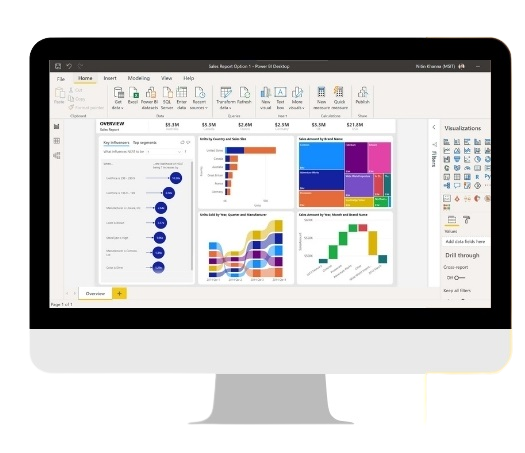
Power BI offers a wide range of visualization
options to help users better understand and
analyze their data. Here are some of the
visualization options available in Power BI:
Bar chart: A bar chart is a simple chart that
displays data as horizontal or vertical bars. It
is commonly used to compare data across
different categories.
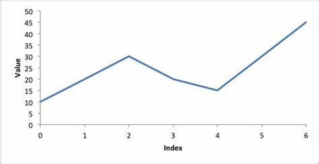
Line chart: A line chart displays data as a
series of points connected by a line. It is commonly used to show trends in data over time.
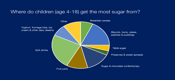
Pie chart: A pie chart displays data as slices
of a pie. It is commonly used to show how a
data set is divided into different categories
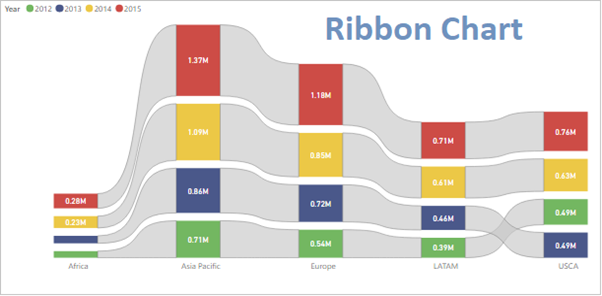
The Ribbon Map visualization in Power BI is
a map that displays data using horizontal
ribbons that are colored based on the data
values. The length of each ribbon
represents the value of the data variable
being displayed. It's a useful way to display
data that varies across a geographic region
in a compact and efficient manner.
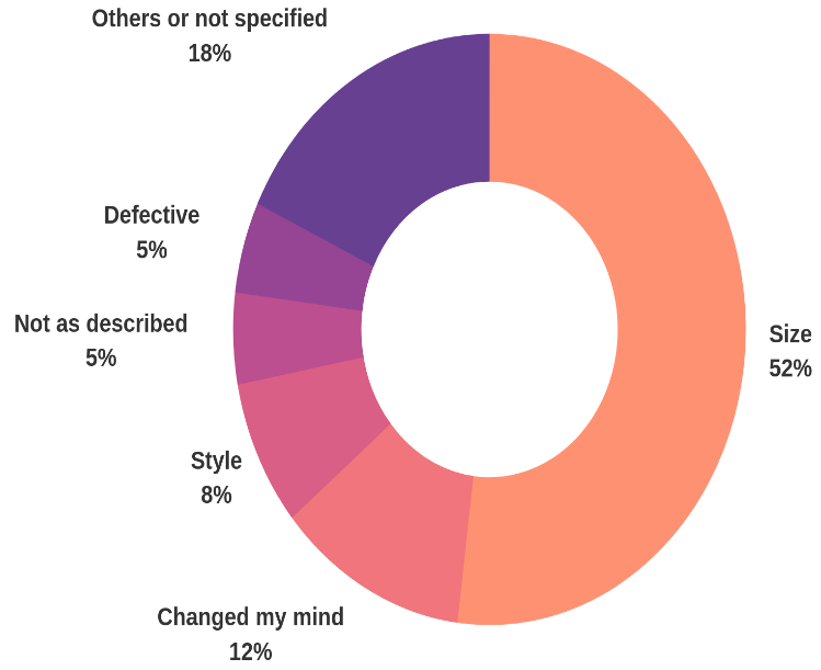
A Doughnut chart is a circular chart with a
hole in the center, used to display data as a
percentage of the whole. It is a variant of the
Pie chart.
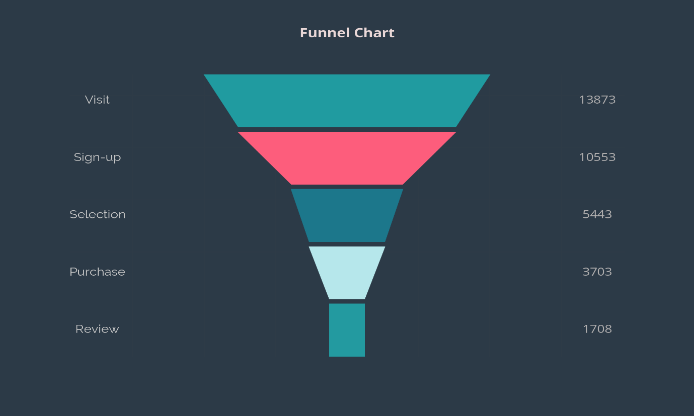
A funnel chart is a specialized
chart type that displays data as a series of
progressively decreasing horizontal bars, with
the bars representing the different stages of a
process. It is commonly used to visualize the
stages of a sales or marketing process, where
the number of potential customers decreases
as they move through the sales funnel.
CSS 3 training insitute | Best IT Training classes in Gurgaon | Web Designing Training Institute